
Senior Product Designer
January 2020 - March 2020
The Returnly Return Center dashboard allows Merchants to easily approve, track, and process product returns and exchanges.
Situation:
The Returnly Return Center had grown organically over the years with no consistent design leadership. Brand color and component patterns were not widely known or enforced, leading to confusion for both users and developers. Features had been introduced without insight into user expectations or information architecture considerations, resulting in duplication of information and pages within the navigation scheme.
Task:
Adapt the website's rebranding to the Return Center dashboard. Simplify information architecture. Develop an implementation plan that adhered to the sprint schedule.
Actions:
• Created a phased approach based on user role and page view analysis
• Created base design system of rebranded reusable components to reduce design & development time
• Provide CSS to front end developers to ensure consistency
• Surveyed components and specified replacements for Return Center experience
• Identified screens that needed full redesign
• Researched best practices for information architecture
Results:
• Rebranding is being applied to all pages in the Return Center in a phased approach
• Reduced the number of button colors from more than 8 to 3, improving usability and reducing QA time
• A library of reusable components was created to improve consistency and ease implementation
• Created a backlog of pages needing redesign
• Proposed information architecture changes to reduce confusing navigation from 14 to 7 options
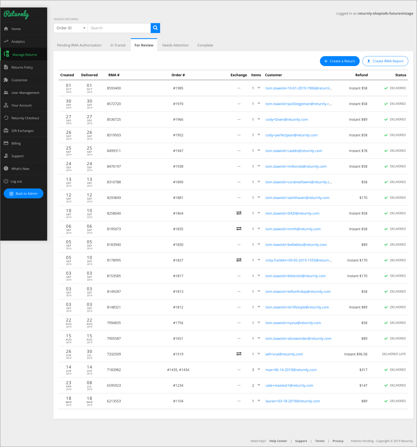
Prior to rebrand and IA simplification
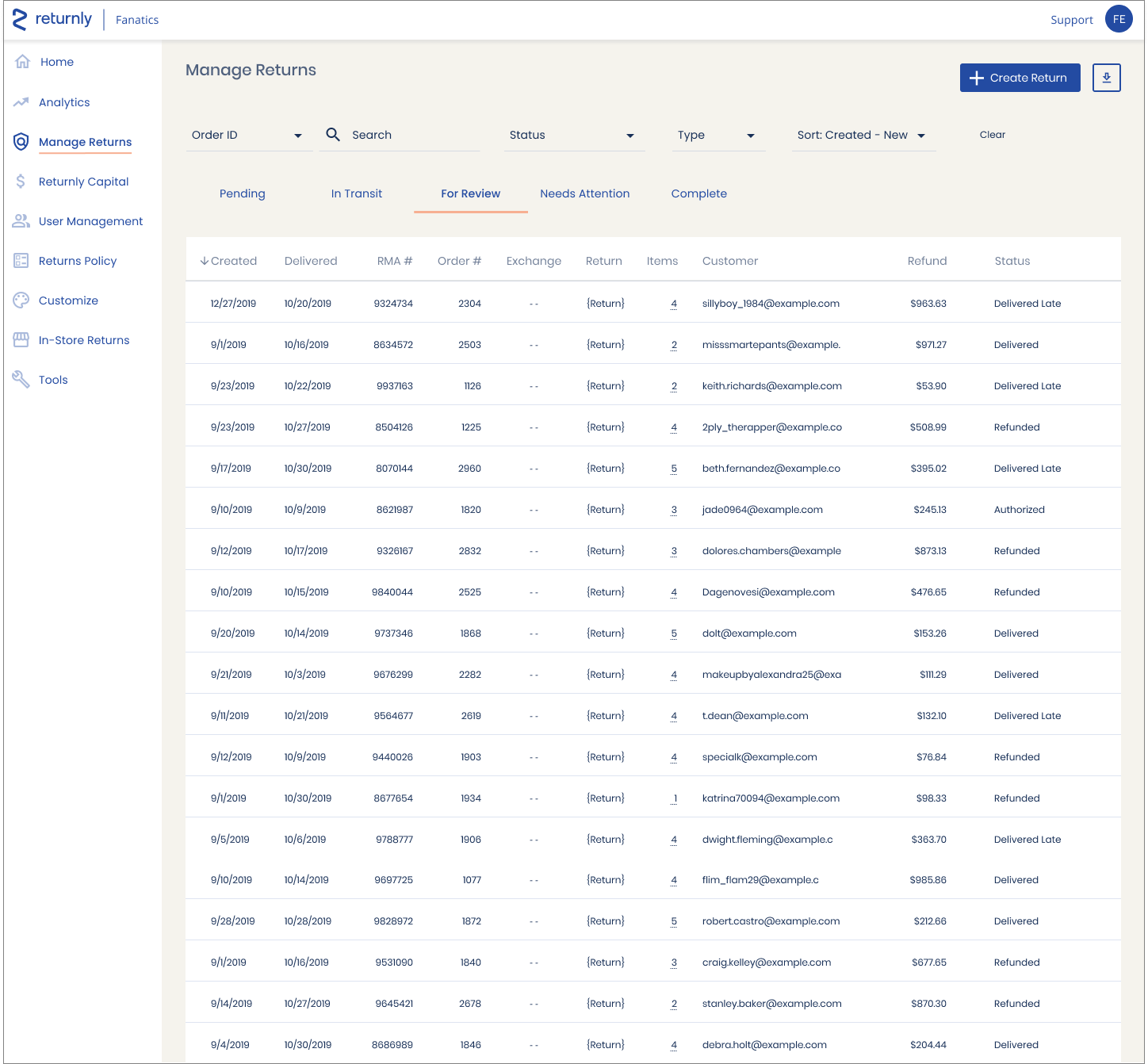
After rebrand and IA simplification

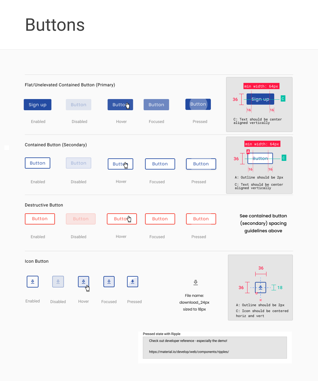
Design system components were built responsively in Figma. For buttons, that meant that horizontal padding was enforced, even after designers changed the button's text.
An example of the Buttons component section of the design library (below).
Video showing editing responsive button